Case study · Lone River Beverage Company
A brand about the uncharted. A customer who wants to know if it's in stock.
Lone River makes Ranch Water and Ranch Rita, and its identity is Far West Texas — the scale of the landscape, the idea of going somewhere nobody has been. Beautiful positioning. It also has to coexist with the least romantic question in drinks: is there any in the shop near me, today. We built the site that answers both, and we still work on it.
- Client
- Lone River Beverage Company
- Sector
- Drinks & FMCG · ready-to-drink
- Services
- Engineering · Experience Design · Integration · Support
- Range
- Ranch Water · Ranch Rita · Lemonade Splash
- Status
- Live, supported and enhanced
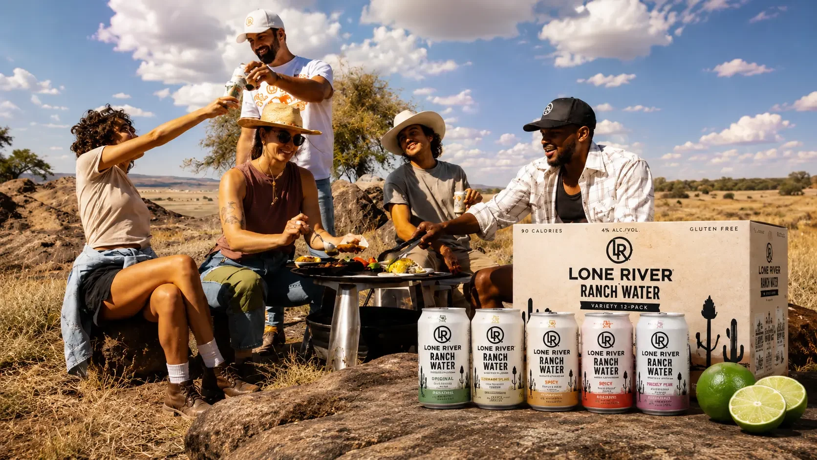
Romance at the top of the page, logistics at the bottom.
Lone River tells a proper story. A river cuts through the high desert of Far West Texas; out of it flows Ranch Water. Legend has it the first person to taste it followed miles of Texas stars and was found asleep under a piñon tree. Nobody knows what happened on that journey. That's genuinely good brand writing, and it's why people remember the name after seeing a can once.
But American drinks distribution doesn't care about any of that. Availability varies by state, by chain, and often by individual store. A person inspired by the brand on Tuesday still has to find a can on Saturday, and if the site can't tell them where, the inspiration expires quietly in a car park.
Add the ordinary complications. Three separate product families — Ranch Water, Ranch Rita and Lemonade Splash — carrying four flavours each, plus variety packs. A brand site with no checkout of its own, but a merchandise store living alongside it. And the compliance requirements that come with selling alcohol across US states.
On most brand sites the store locator is the page nobody designs. Here it's the page that decides whether the rest of the site was worth building.
Three problems behind a simple-looking site.
A handful of pages and a search box. Underneath, the three things that actually determine whether it works.
A national brand isn't nationally stocked. Somebody in a well-served city and somebody two hours from anywhere need the same page to be useful — and the second person must never reach a dead end.
People don't think "in-store or online", they think "how do I get some". The answer has to hold both without turning a simple search into a decision the visitor didn't ask to make.
Landscape photography is the brand. It's also weight, and most visitors arrive from social on a phone. The imagery had to stay and the page still had to appear quickly.
A short site with one page doing the heavy lifting.
Flavours, Find Us, Contact, Subscribe. Four destinations, and the second one carries most of the commercial weight.
Enter a zip code, get nearby stockists and the online options that ship to that area. It's treated as a first-class part of the experience rather than a utility bolted to the footer, because for a retailer-led drinks brand this is the only page that converts.
- Zip-code search — the way an American actually describes where they are
- Local stores and online delivery returned together, not as separate journeys
- Results reflect what's actually available in that area
- Reachable from every page, because the question arrives at any moment
Ranch Water, Ranch Rita and Lemonade Splash are genuinely different propositions — a hard seltzer, a margarita-style drink and a lemonade — not variants of one thing. The navigation opens into families rather than flattening everything into a single list, and each flavour has a real page a campaign can link straight to.
- Ranch Water — Original, Spicy with muddled jalapeño, Rio Red Grapefruit, Blackberry
- Ranch Rita — Classic, Spicy, Mango, Blood Orange
- Lemonade Splash — Original, Blueberry, Hot Honey, Prickly Pear
- Variety packs merchandised as their own thing, because that's how people try a brand
- A new flavour is a content task — Blackberry Ranch Water arrived without a release
A brand that sells through retail can't see who bought a can. The subscriber list is the only direct relationship it has, so the sign-up is wired properly into the marketing and customer systems with permission travelling alongside the person.
- Permission recorded at the moment it's given, with the region attached
- Marketing profile and customer record created together
- Withdrawal flowing back to every system holding that person
- Its own page in the navigation, not an interruption over the content
Never let a search end in nothing.
The hardest state to design on a store locator isn't the successful one. It's the search that comes back empty — someone in a rural county, or a state the brand hasn't reached, typing in their zip code and finding out the answer is no.
Handled badly, that's the end of the relationship. A person who was interested enough to search is the most valuable visitor the site gets, and an empty results page tells them to go and buy something else. So the empty state was designed as carefully as the successful one.
If nothing is stocked nearby, online delivery options are offered in the same view. The search never terminates in an apology.
Nothing within a few miles doesn't mean nothing at all. The search reaches further out rather than reporting failure at the first radius.
Someone who searched and found nothing is a subscriber worth having. The sign-up is right there, so a no today can become a message when that changes.
Where the brand genuinely isn't available, the page says so plainly rather than returning a list of stores that don't stock it. A wasted trip costs more goodwill than an honest no.
Design the conversion first, then the atmosphere.
The usual order on a brand site is to design the story and add the practical pages at the end. We inverted it, because on a retailer-led brand the practical page is the one that pays for the rest.
The store locator was scoped and designed before the storytelling pages, so it got the best thinking rather than whatever attention remained at the end of the project.
Ranch Water and Ranch Rita designed as separate families from the start, so adding variants later is a content task rather than a restructure.
The photography is the brand and was never the variable. Server-rendered pages and per-device image sizing carry the weight instead.
Sign-ups connected into the marketing platform and customer records with permission travelling alongside, and withdrawal flowing back.
Still ours. New flavours, seasonal campaigns, locator improvements, performance work and platform maintenance as ongoing work.
The brand changed. The site didn't need rebuilding.
Lone River has grown from one product family to three, added flavours along the way, and been through a full identity refresh — a reimagined logo struck by a West Texas blacksmith with real branding irons, and packaging drawn from the stitching on cowboy boots. Most brand sites of that age would have been thrown away and started again.
This one absorbed it. Because the families, flavours and imagery were built as content rather than baked into pages, a new look and a new range are updates instead of a rebuild — which is the entire argument for structuring a site properly on day one.
Fast on a phone, editable in an afternoon.
Two tests decided every choice: does it appear before someone's thumb moves on, and can the brand team change it without booking developer time.
- Next.js
- Server-rendered pages
- Optimised imagery
- Mobile-first layouts
- Contentful
- Product families & variants
- Brand-team publishing
- Locale-aware routing
- Zip-code search
- Nearby stockists
- Online delivery options
- Designed empty states
- Marketing platform sign-up
- Customer record creation
- Consent captured at source
- Hand-off to the merch store
Related case studies.

Aviation came to us already live. We're the team that keeps it current — seasonal launches, limited editions and campaign moments shipped into a codebase we inherited, at the pace a brand famous for fast marketing actually moves. Taking over someone else's platform well is a different discipline from building your own, and it's the one this project is about.
Kaneff Group held more than 7 TB of documents across on-premise servers — no naming standards, large volumes of duplicates, and thousands of scanned drawings and PDFs that no search could reach. Any supplier could have copied it all to the cloud. We read it first, then decided what deserved to move.