Case study · Diageo · Taffer's Browned Butter Bourbon
Curiosity gets them to the page. Doubt stops them buying.
Browned butter bourbon is an unusual proposition. The name does the hard work of getting attention — and then creates a question the site has to answer before anyone reaches for a bottle. We designed and built the brand experience from scratch, inside Diageo's compliance requirements, and we still ship changes to it.
- Client
- Diageo — Taffer's Browned Butter Bourbon
- Sector
- Drinks & FMCG
- Services
- Experience Design · Engineering · Integration · Support
- Scope
- Designed and built from scratch
- Status
- Live, supported and enhanced
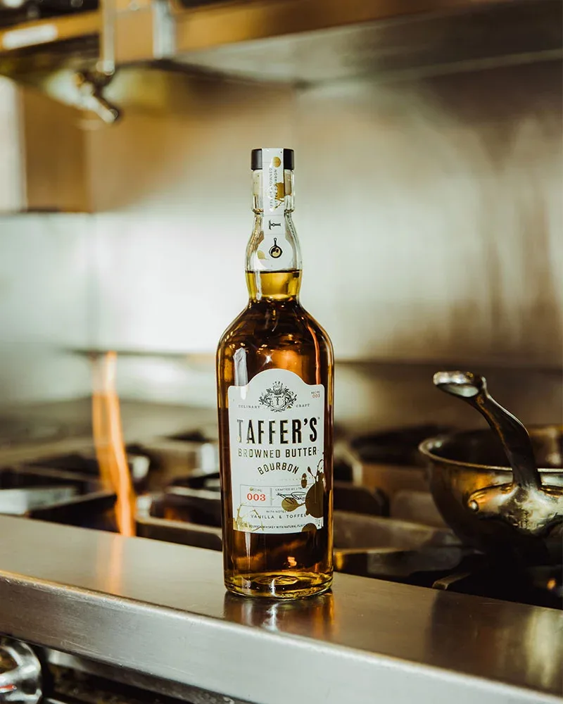
An unfamiliar product, and a doubt the site can't hear.
Taffer's began in a Georgia tavern. Someone took an Old Fashioned, worked browned butter into the bourbon to see whether it tasted better, and it did. That's a good story — but “browned butter bourbon” still lands on a stranger as a question rather than an invitation.
The name earns a click. What happens next is the whole problem. A visitor is curious, slightly sceptical, and has never tasted it — and there's no sample, no bartender, no one to ask. The site has to answer a hesitation nobody voices, in the seconds before someone decides it isn't for them.
Two things made that harder. The brand carries Jon Taffer's name, so the personality has to feel like his rather than like a corporate drinks page. And it sits inside Diageo, which means age verification, market-specific privacy rules and a set of mandatory legal links on every single page — none of them negotiable.
The site doesn't sell anything directly. Its entire job is to turn curiosity into intent, then hand the person to a retailer or the shop. Everything on it either does that or it's in the way.
Three constraints, none of them visual.
The design work people notice is the photography and the type. The work that decided whether this succeeded was elsewhere.
Before anyone sees a bottle, a colour or a word of the story, they meet an age check. It's the worst possible first impression for a brand built on warmth — and it isn't optional, so it had to become part of the experience rather than a barrier standing in front of it.
Conditions of use, community guidelines, accessibility, privacy, cookie controls, responsible drinking, and a US privacy request route. Ten mandatory elements on a page whose job is to feel like a bar in Georgia.
You can't sample a drink through a screen. Everything that reduces doubt has to be borrowed — proof from other people, a reason to buy this week, and a route to a bottle that doesn't make anyone hunt.
Four answers to the same hesitation.
Each part of the site removes one specific reason someone doesn't buy. Nothing on it is there because brand sites usually have one.
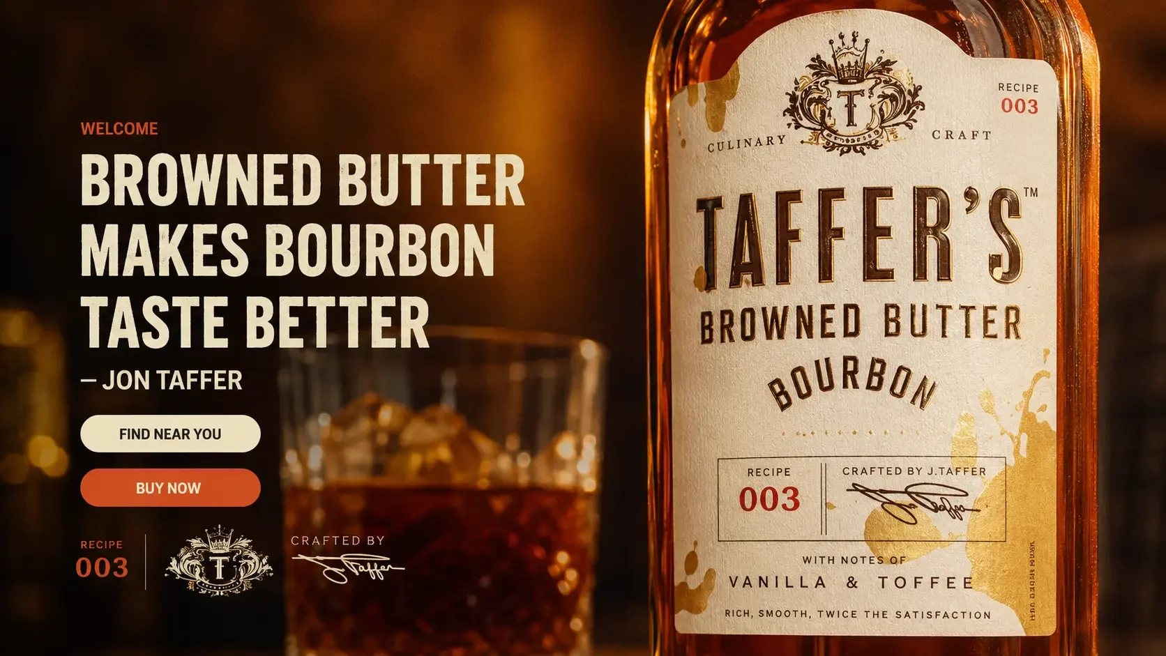
The origin does the persuading — a real tavern, a real experiment, a drink the bar became known for. Told in the length someone will actually read on a phone, with the bottle doing the rest.
- Tasting notes stated plainly — vanilla, toffee, browned butter
- “Familiar enough to sip, different enough to remember” — the reassurance and the hook in one line
- Founder's voice kept intact rather than smoothed into brand copy
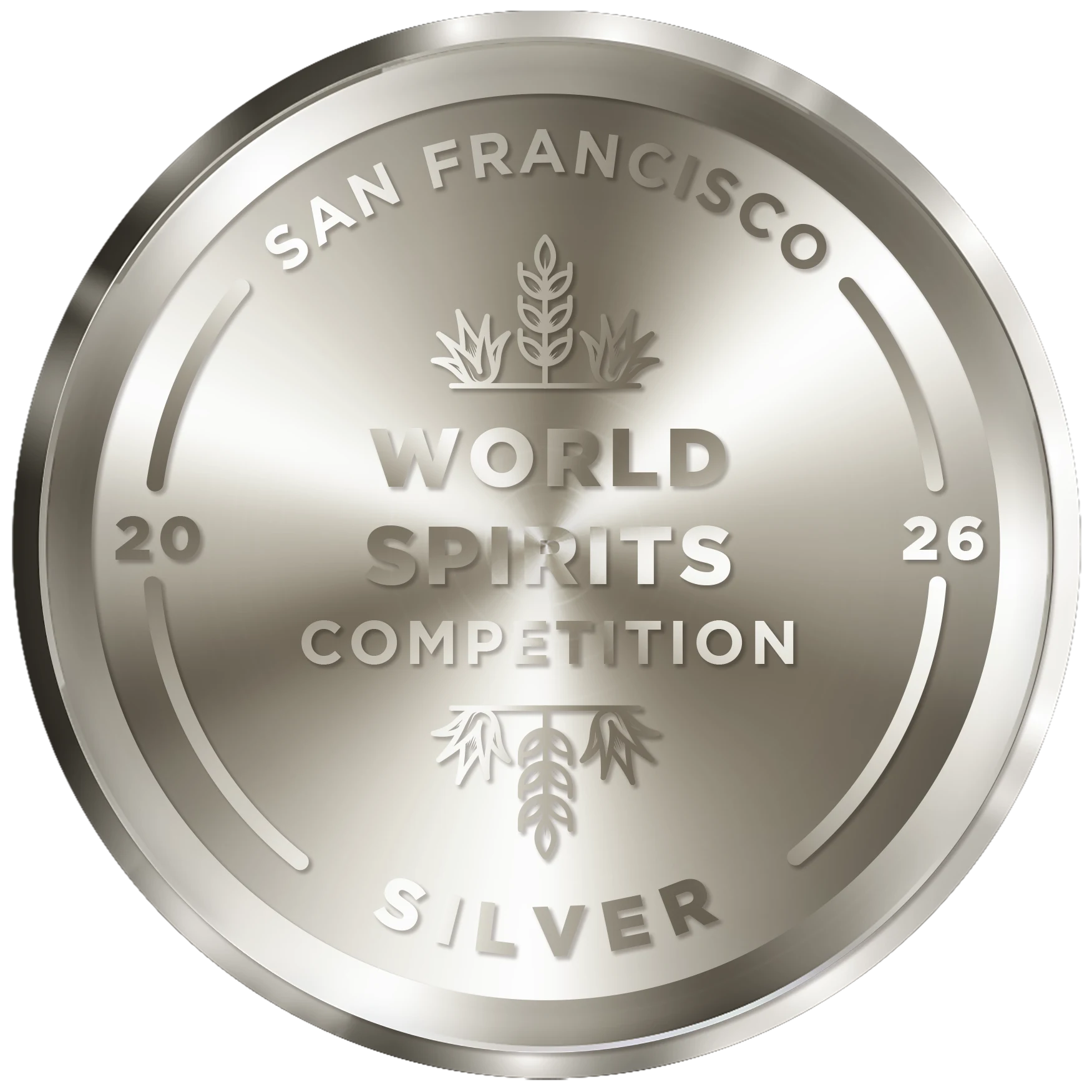
Independent blind-tasting results are the closest thing to a taste you can offer through a screen. So they don't sit on a separate page nobody visits — they appear on the homepage, at the point where someone is deciding whether an unusual bourbon is actually any good.
- Medals shown as artwork, not text — recognised in an instant
- Judged by consumers and by the industry — two different kinds of reassurance
- Managed as content, so a new medal is published the week it's announced

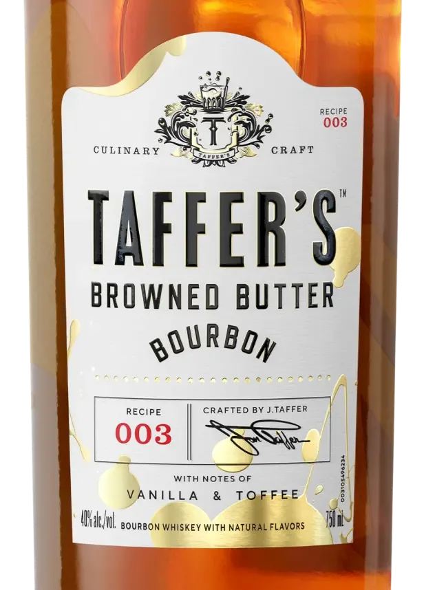
“Rich and bold” is a description. “Make this Old Fashioned in seconds” is a plan for Friday. Recipes give someone a concrete use for a bottle they don't own yet — and they're what people search for, so they bring their own traffic.
- A proper section with its own navigation, not a strip on the homepage
- Built around the product's advantage — the flavour is already in the bottle, so the recipe is short
- Marketing team publishes new recipes without a development release
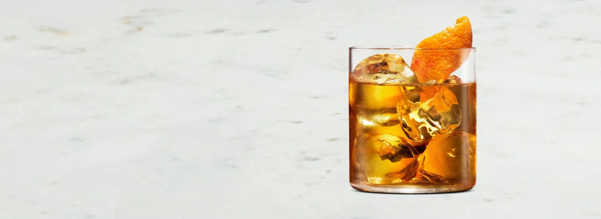
The moment someone wants it is the moment the site should stop persuading. Find Near You and Buy Now are reachable from anywhere, and the sign-up carries permission properly into the marketing and customer systems behind it.
- Retailer lookup one tap from every page, not buried in a footer
- Clean handover to the shop, rather than a second checkout to maintain
- Sign-up flowing to marketing and customer records with consent attached
- Withdrawal of consent reaching every system that holds the person
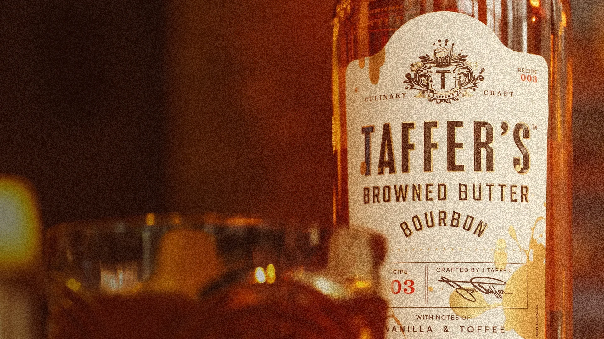
Designing the rules you can't negotiate.
Most brand sites treat compliance as something to survive. On a Diageo property it arrives first and stays on every page — an age check before anything else, ten mandatory legal elements at the foot, and a US privacy request route that has to work.
Handled badly, that's the whole experience. A cold interstitial, a wall of grey links, and a warm brand suddenly feels like a terms-and-conditions page. So we designed those elements rather than accepting them, and it's the part of this project we'd point at first.
Same typography, same colour, same tone as everything behind it — so the first thing a visitor meets reads as the start of the experience rather than a gate in front of it.
All ten present, correctly labelled, keyboard reachable and legible — not shrunk to six-point grey in the hope nobody looks. Accessibility is one of the links; it would be strange to fail it.
Cookie controls remain reachable after the first visit, and the US privacy request route is a working path rather than a link that exists to be pointed at.
The responsible drinking message is present and clear, placed where it's read rather than hidden — and worded so it sits with the brand instead of interrupting it.
Designed and built by one team, then kept improving.
Design and engineering worked together throughout, which is why the site that launched matches the one that was drawn — and why we could keep changing it afterwards without the structure fighting back.
Working with the brand team to establish what the site actually had to overcome — not “raise awareness”, but the specific doubt an unfamiliar bourbon creates in someone who's never tasted it.
Most visitors arrive from social, on a phone, with limited patience. Every layout decision was tested against that rather than against a desktop mock-up in a design tool.
Content managed independently, so a new recipe, a new award or a seasonal update happens in an afternoon rather than through a release process. That's why the 2026 medals appeared when they did.
Sign-ups connected into the marketing platform and customer records with permission travelling alongside — and withdrawal flowing back to every system holding that person.
Still ours. New content types, seasonal campaigns, performance work and platform maintenance — delivered as ongoing work rather than through a change request each time.
We didn't hand over the keys.
Launching a brand site is the easy half. The half that decides whether it keeps earning is what happens over the following years — new awards, new recipes, seasonal campaigns, privacy rules that change, and the steady maintenance nobody budgets for.
Two 2026 competition medals are live on the site today because the team who built it is the team who publishes to it. That's the difference between a site that ages and one that stays current.
Fast to load, easy to change.
A brand site lives or dies on two things: how quickly it appears on a phone, and how easily the marketing team can change it without calling us. Everything here serves one of those.
- Next.js
- Server-rendered pages
- Optimised imagery
- Mobile-first layouts
- Contentful
- Structured content types
- Marketing-managed publishing
- Locale-aware routing
- Marketing platform sign-up
- Customer record creation
- Consent captured at source
- Retailer locator
- Age verification
- Cookie consent management
- US privacy request route
- Accessibility standards
Related case studies.
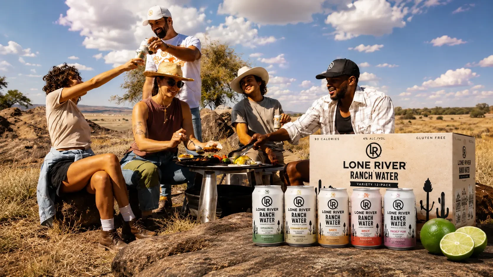
Lone River makes Ranch Water and Ranch Rita, and its identity is Far West Texas — the scale of the landscape, the idea of going somewhere nobody has been. Beautiful positioning. It also has to coexist with the least romantic question in drinks: is there any in the shop near me, today. We built the site that answers both, and we still work on it.
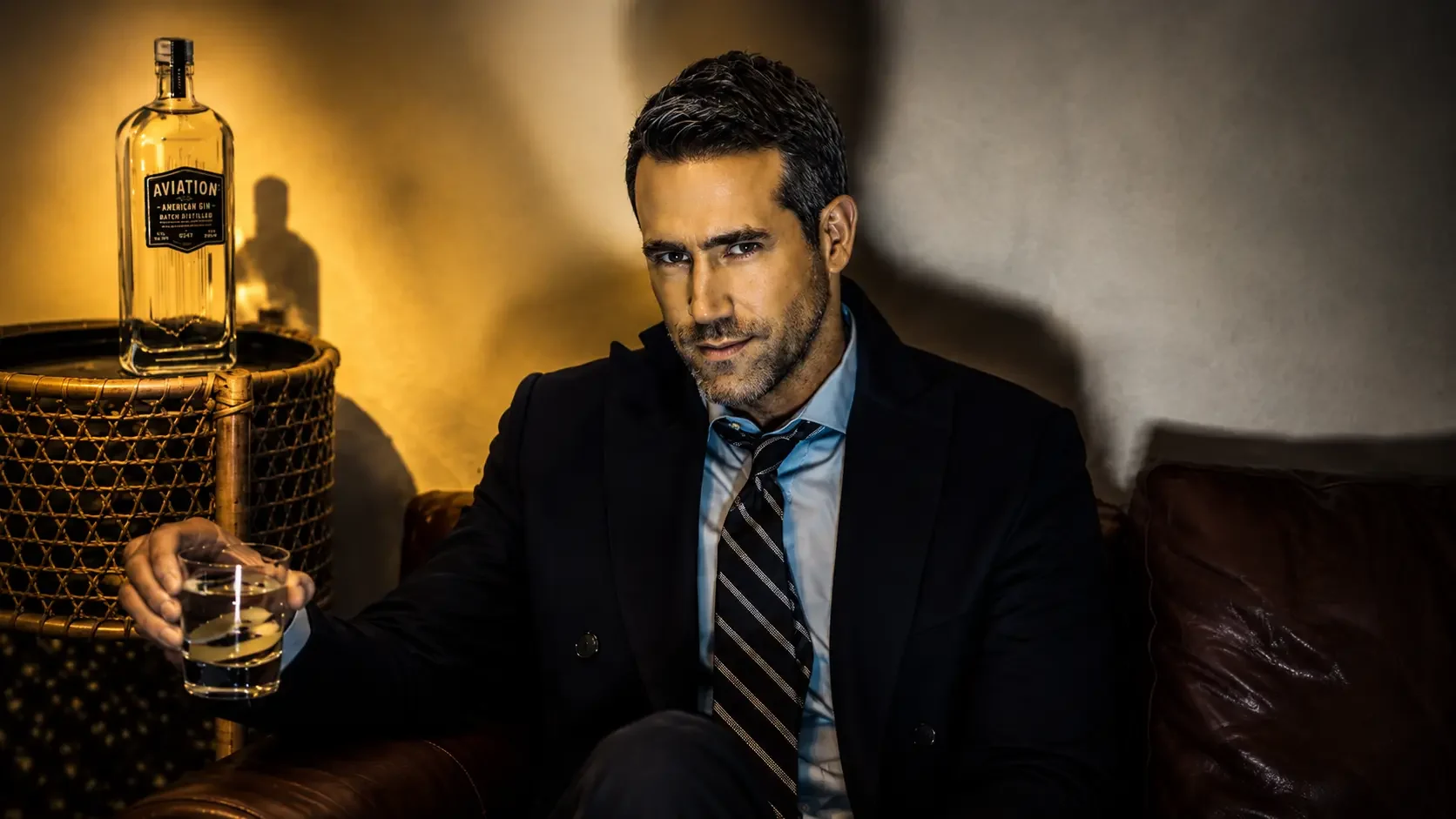
Aviation came to us already live. We're the team that keeps it current — seasonal launches, limited editions and campaign moments shipped into a codebase we inherited, at the pace a brand famous for fast marketing actually moves. Taking over someone else's platform well is a different discipline from building your own, and it's the one this project is about.