Case study · Diageo · Stoop Dayz Hard Soda
The brand says take it easy. Websites are built to push.
Stoop Dayz is hard soda for people with no plans — “all flavor, no fuss”, built on the idea that the best moments were never scheduled. Almost every default move in web marketing works against that. Pop-ups, countdowns, urgency, sign-up interruptions. We designed the site without any of them, and made it earn attention rather than demand it.
- Client
- Diageo — Stoop Dayz Hard Soda
- Sector
- Drinks & FMCG
- Services
- Experience Design · Engineering · Integration · Support
- Scope
- Designed and built from scratch
- Status
- Live, supported and enhanced
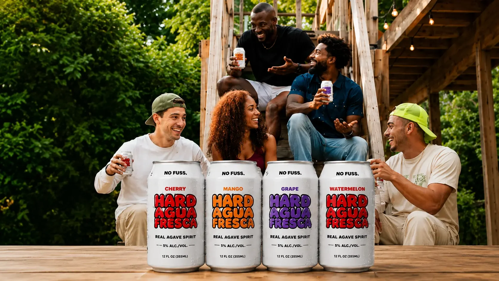
Selling "no plans required" without pushing.
Stoop Dayz has a genuine point of view. The world is obsessed with being busy — more plans, more pressure, more noise — and the best times usually started with none of it. Just people on a stoop and a couple of cold ones.
That's a real position, and it puts the brand at odds with how commercial websites normally behave. The standard toolkit is built on manufactured urgency: an email pop-up two seconds after arrival, a banner that follows you down the page, language designed to make you act now. Every one of those would have told a visitor that this brand doesn't mean what it says.
Underneath sat the ordinary commercial requirements. It still has to explain four flavours, get people to a shop, collect an audience for the next campaign, and satisfy Diageo's compliance rules on every page. None of that goes away because the tone is relaxed.
A brand about slowing down can't have a site that hurries you. That sounds like a copy decision. It's actually a structural one, and it had to be made before anything was designed.
Three problems hiding behind a simple brief.
"Build a site for a hard soda brand" is a two-line brief. These are the parts that actually took the thinking.
Removing pushy patterns is easy. Still converting afterwards is not. If the site doesn't interrupt anyone, every route to a shop and every reason to subscribe has to be genuinely well placed rather than forced into view.
Cherry, orange, grape and root beer are childhood flavours, so the choice is personal and often nostalgic. Unlike a variety pack brand, "which one" is the conversation people actually have — and the site had to support it at that level.
Retro references are one degree away from costume. The design had to feel like an old soda fountain without becoming a pastiche of one, because a brand built on being unpretentious can't afford to look like it's trying.
A site that gets out of the way.
Home, Flavors, Where to Buy, Subscribe, Contact. Each one does a job, and none of them chase anybody.
Most drinks sites open with a product shot and a buy button. This one opens with what the brand actually thinks — a short piece of writing about scheduled lives and unscheduled evenings — because the position is the product differentiator, not the flavour list.
- Copy given room to be read rather than compressed into a strapline
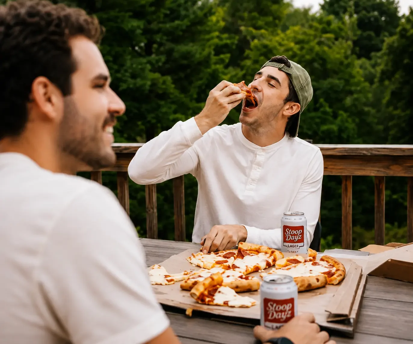
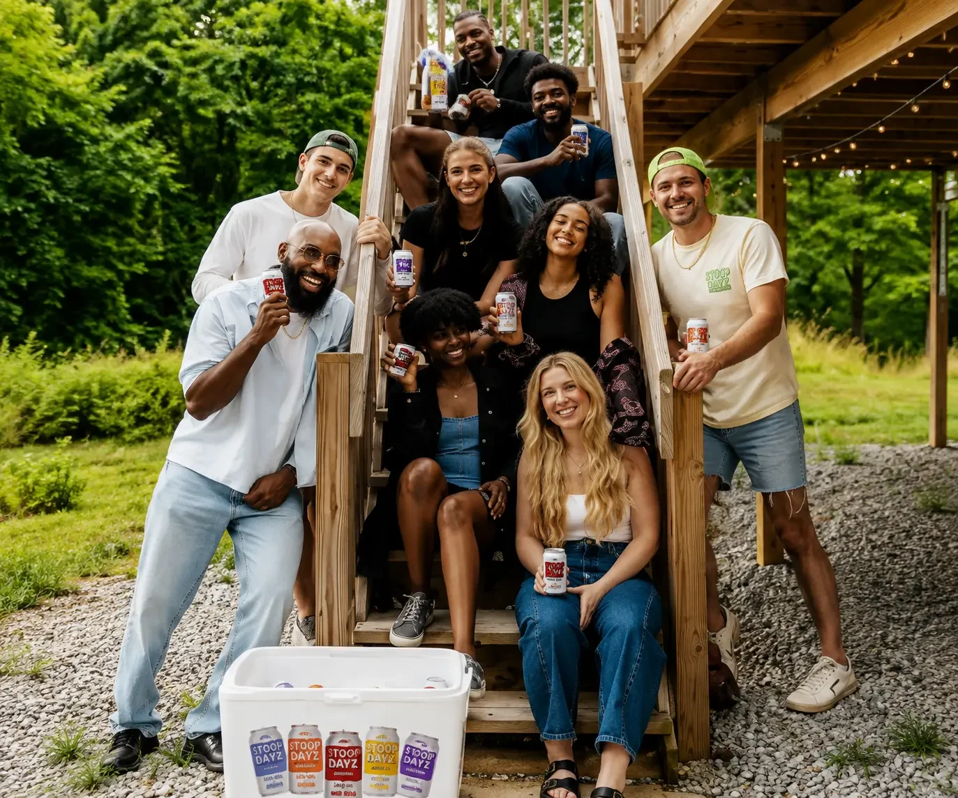
- Photography of people on stoops, playing basketball, sharing pizza — the occasion, not the product
- A single route onward, offered once, in the place it's wanted
Each flavour has real tasting notes, its own colour and — crucially — its own link. Someone recommending "the root beer one" can send a link that lands on root beer, rather than a homepage their friend then has to navigate.
- Direct links to each flavour, reachable from the main navigation
- Tasting notes written properly — sassafras, Concord grape, citrus peel
- Strength shown plainly on every flavour, not tucked into a footnote
- Structured so a fifth flavour is a content addition, not a rebuild
Classic soda fountain. Maraschino aroma, lemon-lime fizz, notes of pomegranate.
4.5% ABVZingy and bright. Ripe orange and citrus peel, zesty and tangy.
4.5% ABVSweet up front, tart on the tail. Big juicy Concord grape throughout.
4.5% ABVCreamy vanilla, a little sassafras, a hint of spice. A fizzy throwback.
4.5% ABV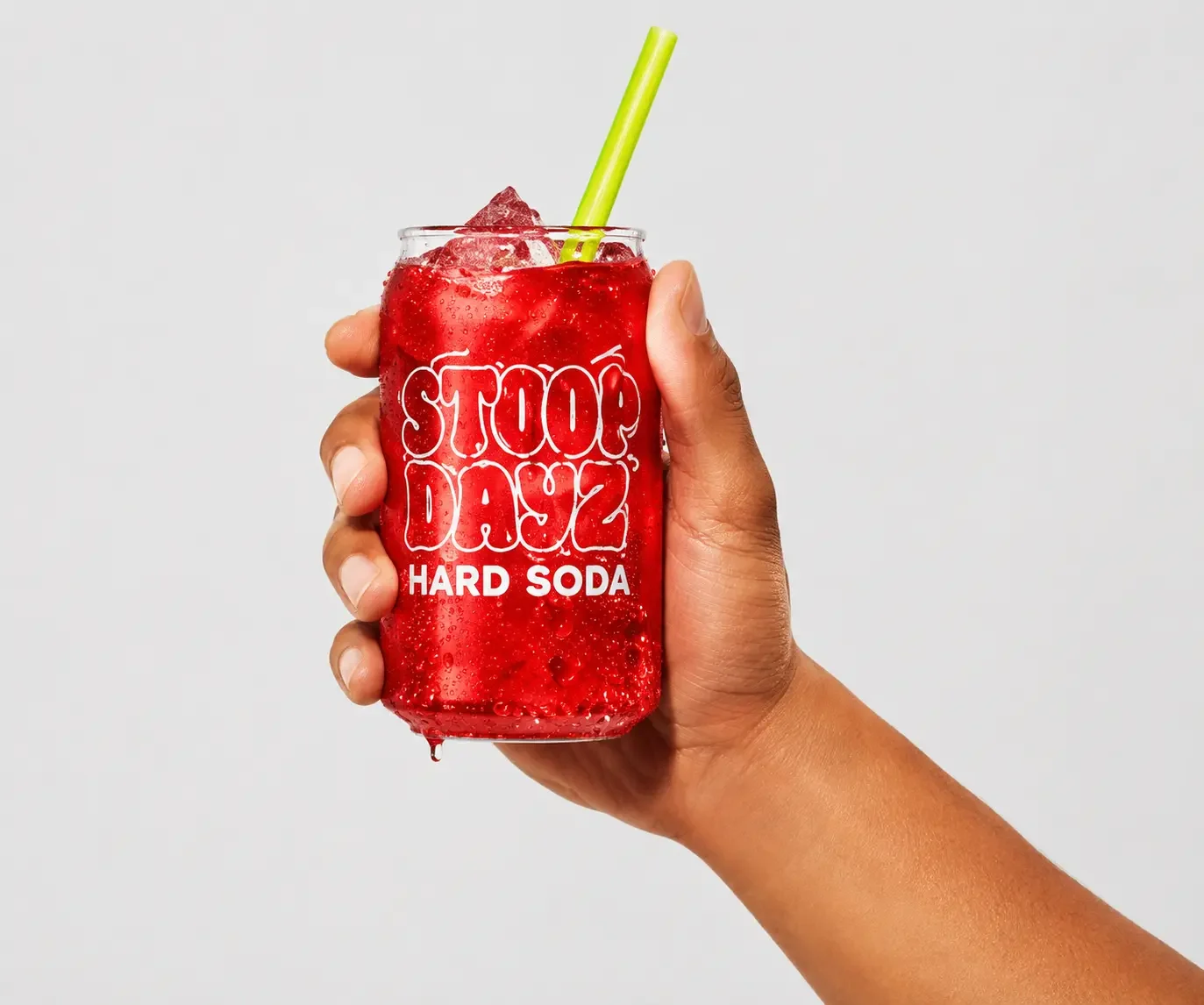
The route to purchase carries the brand's own voice rather than switching to transactional language at the last moment. It's reachable from anywhere, offered rather than pushed, and hands people to the retail channel that actually sells the product.
- Retailer lookup in the navigation, present on every page
- No competing checkout to build, maintain or split effort across
- Tone held all the way to the last screen
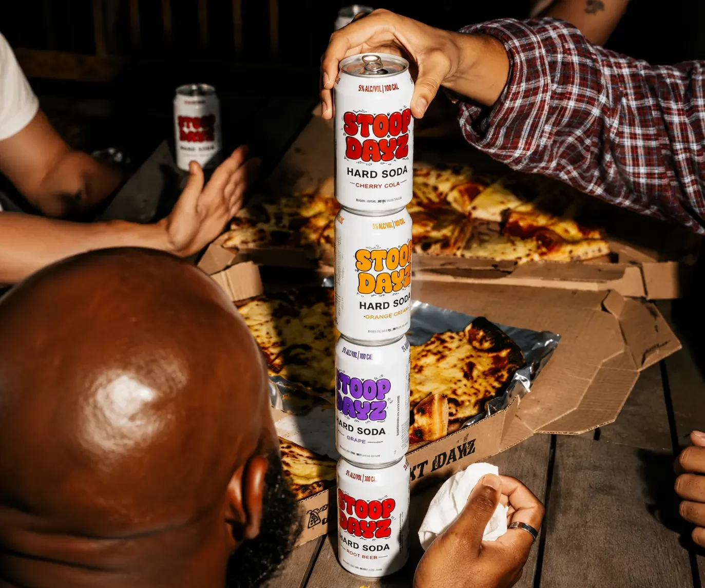
The email list still matters — it's the audience for the next flavour and the summer campaign. So it gets a proper page that someone chooses to visit, instead of a dialogue that lands on top of what they were reading. Fewer sign-ups per visit, from people who actually meant it.
- Its own destination in the navigation, never an interruption
- Permission recorded at the moment it's given, with the region attached
- Marketing profile and customer record created together, consent attached
- Withdrawal flowing back to every system holding that person
Every pattern we didn't use.
There is a standard set of moves for a consumer brand site, and they're standard because in aggregate they work. An email dialogue after a few seconds. A sticky banner. A second banner when the cursor moves toward the tab bar. Copy engineered to create a small amount of anxiety.
Used here, every one of them would have contradicted the product. A brand telling you the best moments aren't scheduled cannot interrupt you eight seconds in to ask for your email. So the constraint we set at the start was that nothing on this site would demand attention — and everything had to still work anyway.
Subscribing is a page you choose to visit. It converts a smaller share of visits, from people who genuinely wanted it — which is a better list for the campaigns that follow.
No sticky bars, no re-appearing prompts. The navigation is always there, which is enough. Someone who wants a shop can find one in one tap from anywhere.
"Grab a case, no plans required" instead of limited time, don't miss out, act now. The invitation does the work that urgency usually does, and it fits the brand rather than fighting it.
The gallery drifts rather than snapping between slides. It's a small thing that sets the pace of the whole page, and it's the difference between a site that feels calm and one that just looks calm.
The tone was a requirement, not a finish.
On most projects, brand voice is applied to a structure that already exists. Here it had to shape the structure, which meant settling it before anything was designed.
Before wireframes, an explicit list of patterns ruled out — pop-ups, urgency language, anything that interrupts. Agreeing that upfront stopped it being relitigated every time a conversion number came up.
With interruption off the table, every path to a shop or a sign-up had to be well placed rather than forced. That's harder, and it's the actual craft of the project.
Direct links into each flavour so recommendations land where they were meant to, and so a campaign can point at cherry without sending everyone to the homepage.
Art-directed imagery for each screen size rather than one crop squeezed down, and content the brand team publishes themselves — new flavours, campaign assets, seasonal updates.
Still ours. Campaign moments, new content, performance work and platform maintenance delivered as ongoing work rather than a change request each time.
Restraint is easy to erode.
A decision not to interrupt people is only as durable as the team defending it. Six months after launch, someone will suggest a pop-up because a number needs moving — and if nobody remembers why it was ruled out, it goes in and the brand quietly stops meaning what it says.
We're still on the site. The team that designed it is the team that publishes to it, which is how a position taken at the start survives contact with the second year.
Fast on a phone, editable in an afternoon.
A brand site is judged on two things: whether it appears before someone's thumb moves on, and whether the marketing team can change it without booking developer time.
- Next.js
- Server-rendered pages
- Art-directed responsive images
- Mobile-first layouts
- Contentful
- Structured flavour content
- Brand-team publishing
- Locale-aware routing
- Marketing platform sign-up
- Customer record creation
- Consent captured at source
- Retailer locator
- Age verification
- Cookie consent management
- US privacy request route
- Accessibility standards
Related case studies.
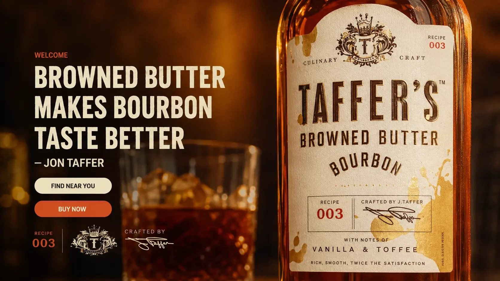
Browned butter bourbon is an unusual proposition. The name does the hard work of getting attention — and then creates a question the site has to answer before anyone reaches for a bottle. We designed and built the brand experience from scratch, inside Diageo's compliance requirements, and we still ship changes to it.
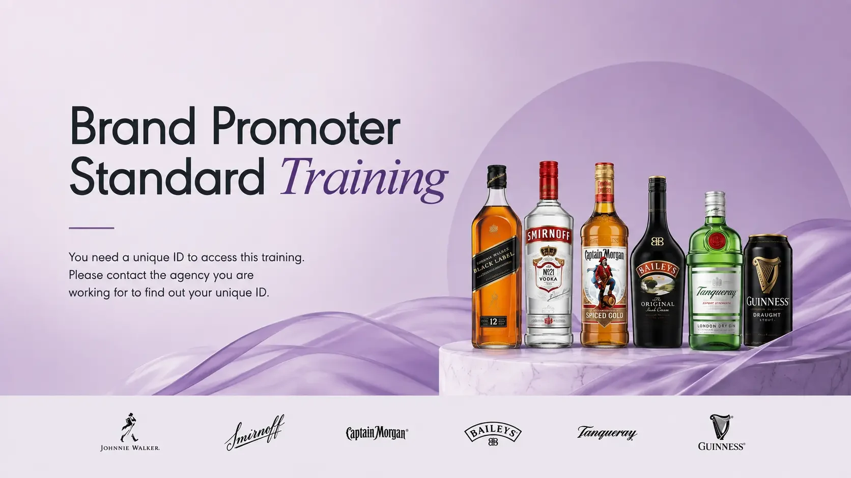
Brand promoters represent Diageo at events and points of sale — but they work for third-party agencies. No company email, no induction day, no HR system. We built the platform that makes sure every one of them understands the standards, in their own language, before they represent the brand. It has been running since 2022.