Case study · Diageo · Tiny Island Cocktails
Everyone knows what a Mojito tastes like. The doubt is the can.
Tiny Island makes mini Caribbean rum cocktails — Hurricane, Mojito, Mai Tai, Daiquiri. Nobody needs those explained, which sounds like an easy brief and isn't. When the drink is familiar, the scepticism moves to the format: can a pre-mixed cocktail in a small can actually be worth drinking? We designed and built the site that answers that, and we still work on it.
- Client
- Diageo — Tiny Island Cocktails
- Sector
- Drinks & FMCG · ready-to-drink
- Services
- Experience Design · Engineering · Integration · Support
- Range
- Four Caribbean rum cocktails
- Status
- Built from scratch, supported and enhanced
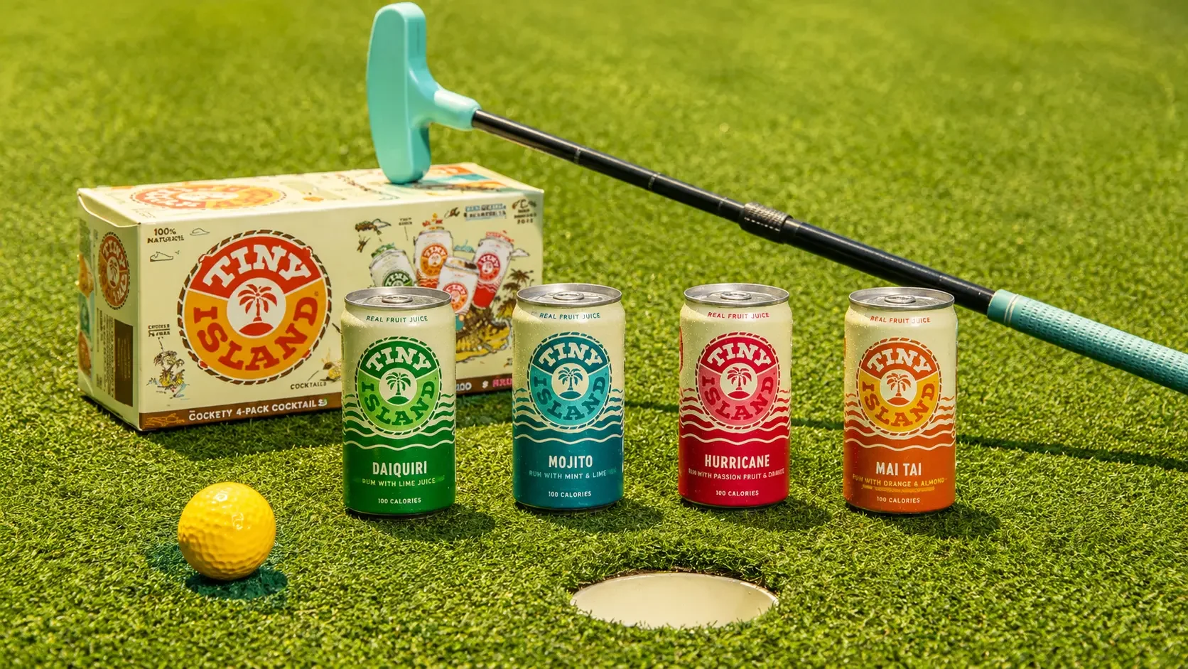
A familiar drink in a doubted format.
Hurricane, Mojito, Mai Tai, Daiquiri. Four cocktails that need no introduction — which removes the usual job of a drinks brand site and replaces it with a harder one.
Because the flavours are known, the shopper isn't wondering what it tastes like. They're wondering whether this version is any good. Ready-to-drink has spent years training people to expect something thin, fizzy and disappointing, and every canned cocktail now inherits that suspicion whether it deserves it or not.
There's a second complication in the name. "Tiny" is the brand's whole idea — tiny choices that make your world bigger, mini cocktails for little escapes and unplanned moments. Charming positioning, and a risk: small can read as less. The design had to make smallness feel generous rather than mean.
Most brand sites exist to explain the product. This one exists to defend the format — and it has to do it in the few seconds before somebody decides a canned Mojito isn't for them.
Three tensions in a four-page site.
The brief looks small. Each of these would have quietly undermined it.
With an unusual product you can explain it and the page writes itself. With a Mojito there's nothing to explain, so every word has to earn its place or the page is padding — and padding reads as a brand with nothing to say.
A brand built on smallness has to be careful. Small format, small moments, small choices — all charming until a shopper hears "you get less for your money". The generosity has to be visible somewhere.
An age check first, then mandatory legal elements on every page. On a site with only four pages, that footer is a large proportion of what's on screen — it can't be allowed to outweigh the product.
Four pages, and two facts doing most of the work.
Home, the four cocktails, About, Where to Buy, Join Us. Short by design — when there's little to explain, length is a liability.
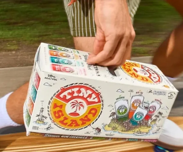
Before a single product appears, three attributes sit under the welcome: Flavor Full, Non-Carbonated, 10% ABV. Two of those are the entire answer to "is this just another seltzer" — and putting them first was the most important layout decision on the site.
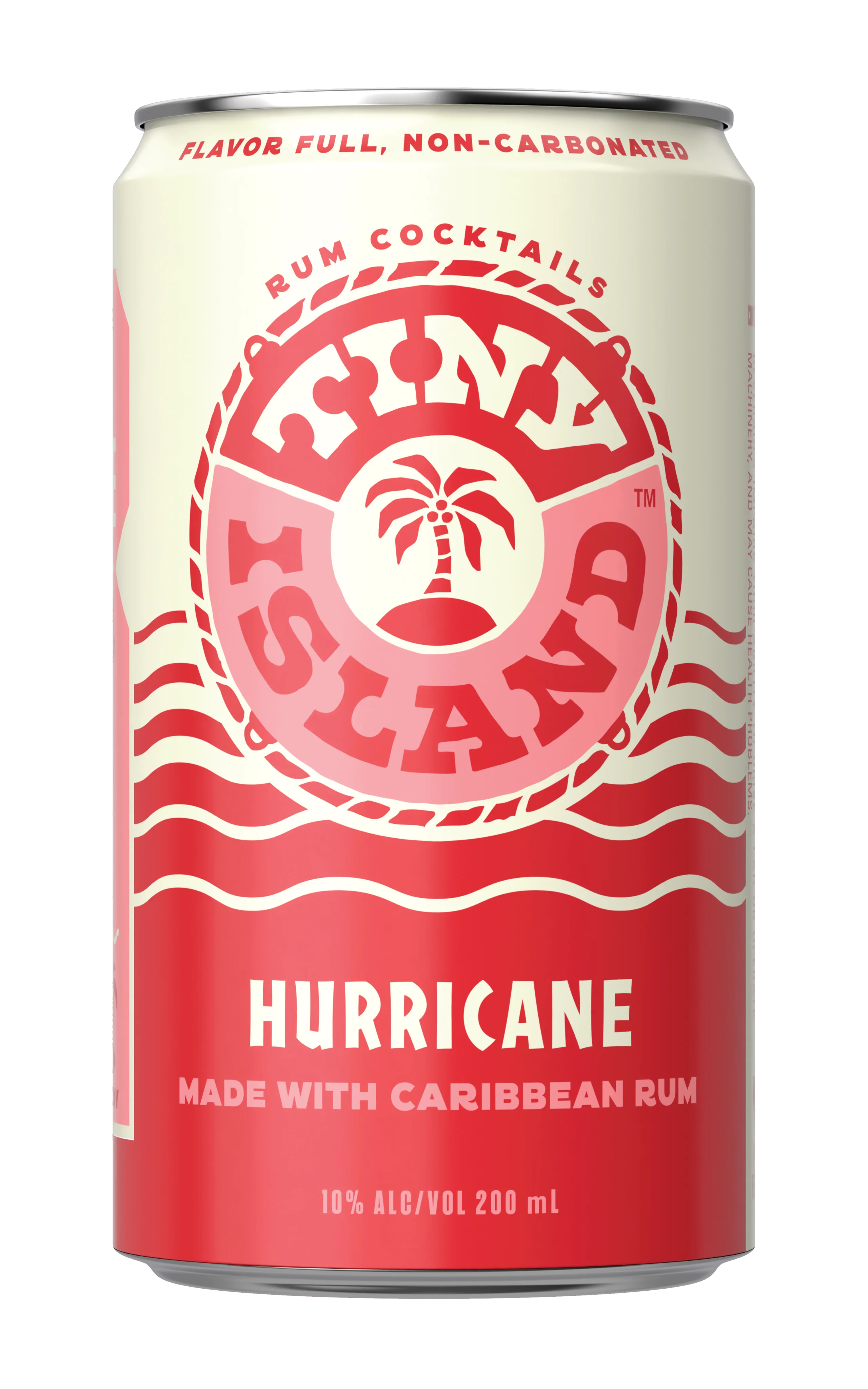
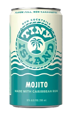
Somebody is a Mai Tai person. Somebody else has never got on with a Daiquiri. Each cocktail has its own page and its own link, so a recommendation lands where it was meant to and a campaign can point at one drink rather than the homepage.
- Tasting notes written properly — passionfruit and strawberry, lime and mint, almond and orange
- Direct links from the navigation, so nobody navigates to find their drink
- Structured so a fifth cocktail is a content addition, not a rebuild
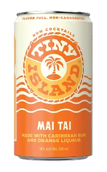
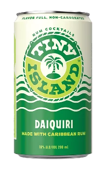
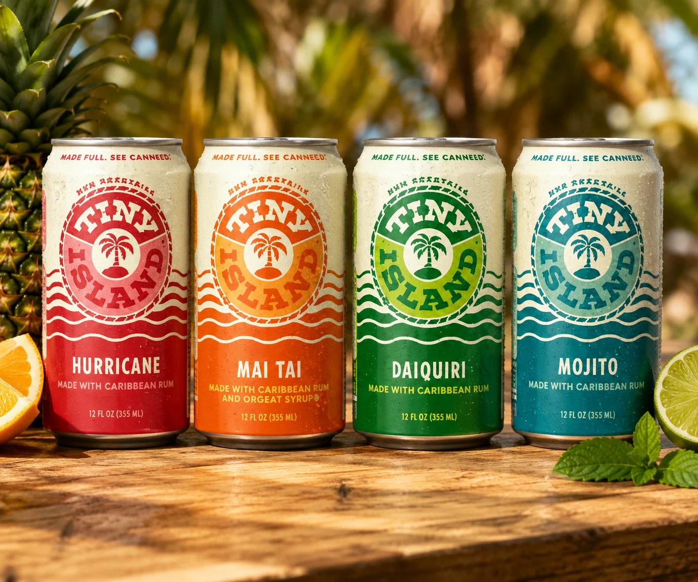
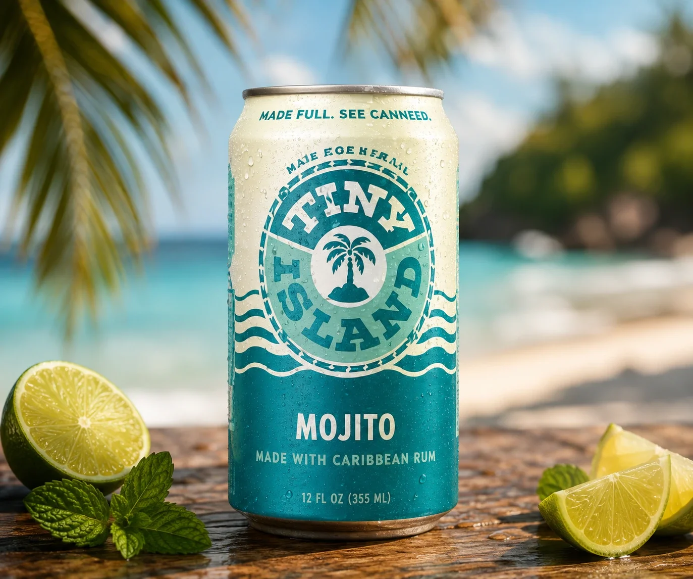
The counterweight to a brand about smallness is the way the site is drawn. Big type, full-width imagery, generous space and a short journey — so the experience feels expansive even though the product is deliberately little.
- The brand line does the reframing — tiny choices that make your world bigger
- Occasion over quantity — little escapes, quick detours, unplanned moments
- A short site treated as confidence, not as a lack of content
The site doesn't sell. Its job ends at a retailer, and at capturing the people who aren't ready yet — with permission recorded properly and carried into the systems behind it.
- Where to Buy reachable from every page, never buried
- Join Us as its own destination, chosen rather than imposed
- Permission captured at source, with the region attached
- Withdrawal flowing back to every system holding that person

Two words and a number, placed before anything else.
Most brand sites put specifications on a product page, below the photography, where the people who care can find them. Here, Non-Carbonated and 10% ABV appear before a single product does — under the welcome, as icons, in the first screenful.
That looks like a small layout choice. It's the argument. Ready-to-drink taught shoppers to expect fizzy and weak, so those two facts do more persuading than any amount of copy about Caribbean rum. Putting them lower down would have meant only the already-convinced ever saw them.
It says this is a cocktail rather than a seltzer with flavouring, in two words, to someone who is scrolling and not reading.
10% is high for the format and it's declared up front rather than buried. Being direct about strength reads as confidence — and it's the responsible thing to do.
Three glass marks and three short labels. Read in a second, at a glance, before any decision has formed.
The same attributes carry through to the individual cocktail pages, so the reassurance is present at the moment somebody picks a favourite.
Find the doubt, then design against it.
With a familiar product, the useful question isn't what to say about it. It's what somebody is silently worried about.
Not "communicate the brand" but something testable: a shopper assumes a canned cocktail is thin and fizzy. Everything on the page was measured against whether it addressed that.
Two product facts moved from a details section to the top of the homepage. The single highest-leverage change on the project, and it cost nothing.
Large type, generous space and full-width imagery, so the format reads as a considered choice rather than a compromise.
Four pages, four links, so a favourite can be shared and a campaign can target a single drink.
Still ours. New cocktails, seasonal campaigns, performance work and platform maintenance delivered as ongoing work.
A four-cocktail range rarely stays at four.
Ready-to-drink moves quickly. Ranges extend, formats change, campaigns arrive with their own requirements, and privacy rules shift underneath. A site built tightly around exactly today's products is a site that needs rebuilding the first time the range grows.
This one was structured so a new cocktail is a content task. We're still on it — publishing, extending and maintaining, so the brand team isn't waiting on a release every time something changes.
Fast on a phone, editable in an afternoon.
The same two tests as every brand site we build: does it appear before someone's thumb moves on, and can the brand team change it without booking developer time.
- Next.js
- Server-rendered pages
- Optimised imagery
- Mobile-first layouts
- Contentful
- A content type per cocktail
- Brand-team publishing
- Locale-aware routing
- Marketing platform sign-up
- Customer record creation
- Consent captured at source
- Retailer locator
- Age verification
- Cookie consent management
- US privacy request route
- Accessibility standards
Related case studies.
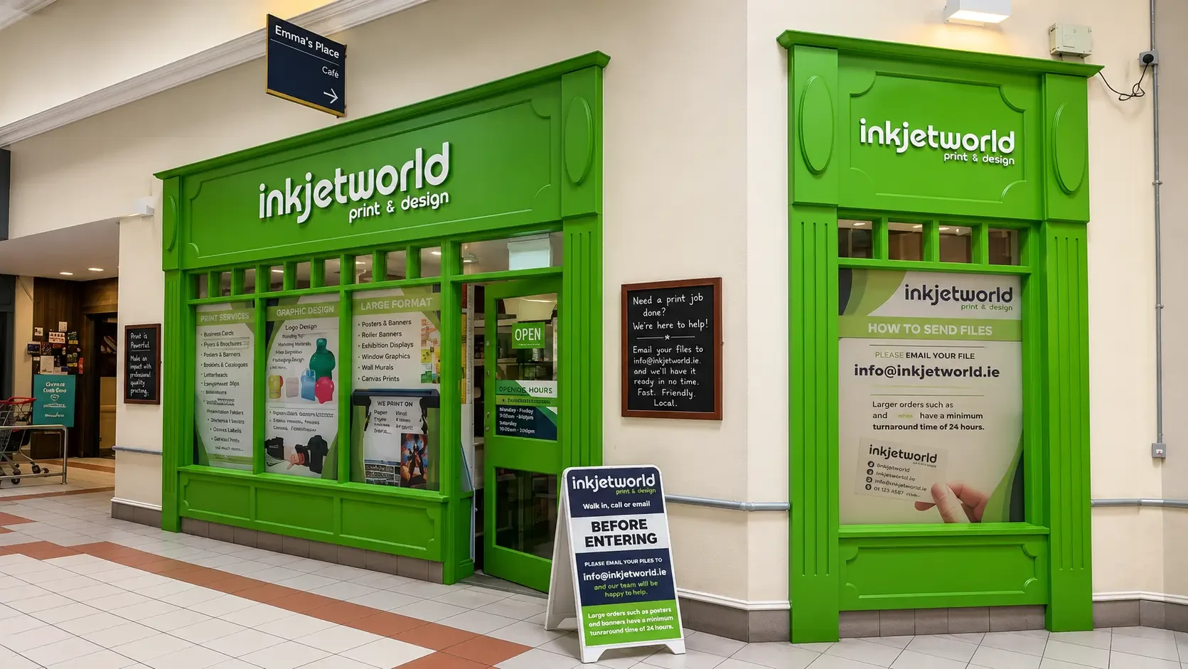
Print has no fixed product. The price depends on size, material, quantity, finish, page count and how many of those pages are colour. Some jobs can be sold from a shelf; others don't have a price until someone has understood them. We designed and built the shop that holds both — for a print business in a Kildare university town — and we still support it.
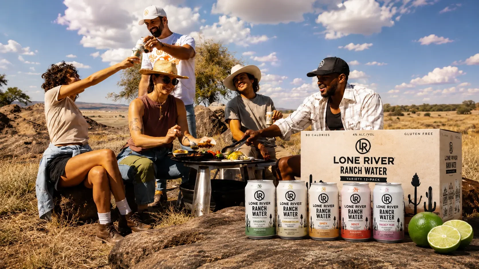
Lone River makes Ranch Water and Ranch Rita, and its identity is Far West Texas — the scale of the landscape, the idea of going somewhere nobody has been. Beautiful positioning. It also has to coexist with the least romantic question in drinks: is there any in the shop near me, today. We built the site that answers both, and we still work on it.