Case study · Diageo · Casa Famosa
Nobody searches for a brand they've never heard of.
Casa Famosa Hard Agua Frescas launched into the most crowded shelf in drinks, with no reputation, no reviews and no awards to trade on. A launch site can't be found by name, because nobody knows the name yet. Its only job is to convert the moment someone does arrive — from a post, a friend, a can they spotted — into a shelf they can walk to.
- Client
- Diageo — Casa Famosa
- Sector
- Drinks & FMCG · new brand launch
- Services
- Experience Design · Engineering · Integration · Support
- Scope
- Designed and built from scratch
- Status
- Live, supported and enhanced
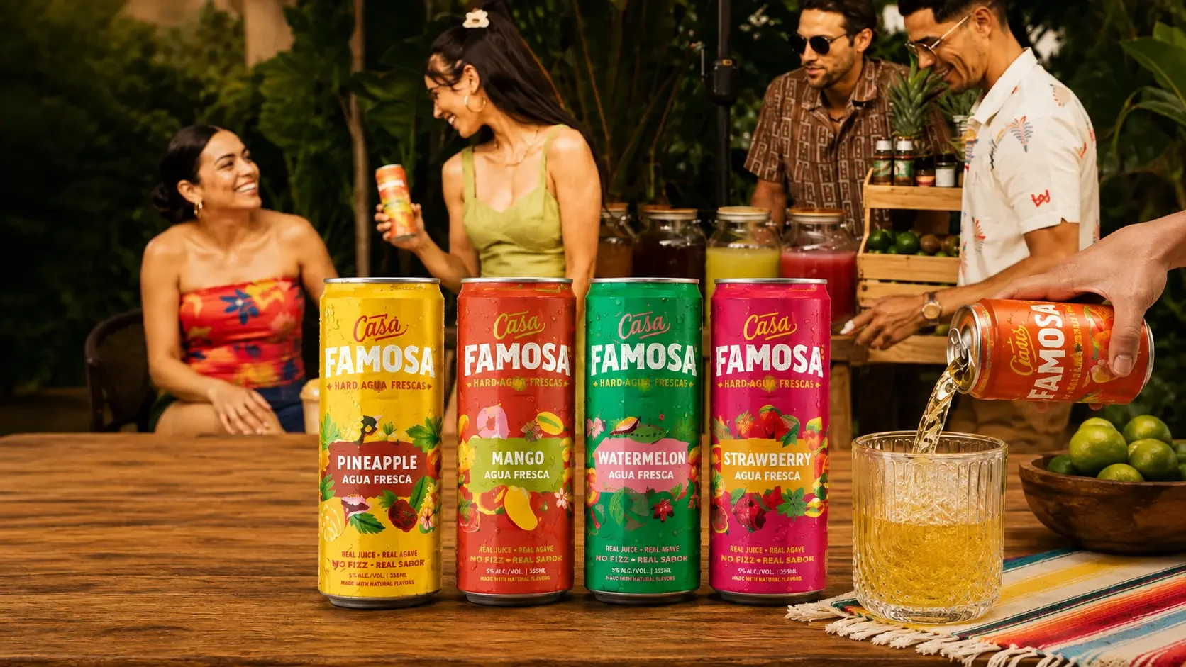
A launch has nothing to trade on.
Casa Famosa is a fresh take on a traditional agua fresca — premium Mexican agave spirit, real juice, no fizz — in four flavours built to be shared. Everything about it is designed for a moment with other people.
But it arrived into ready-to-drink, which is the most contested category in the industry. An established brand can lean on reviews, awards, or the fact that someone's already tried it. A launch has none of that. There's no reputation to borrow and no search demand for a name nobody has heard.
So the traffic doesn't come looking for the brand. It comes from a post someone scrolled past, a friend's recommendation, or a can spotted in a fridge — arriving on a phone, mid-scroll, with the patience that implies. And the actual purchase happens somewhere else entirely: in a shop, days later.
The site isn't a shop and was never going to be one. It exists to take someone from vaguely curious to standing in front of the right fridge. Everything else would be decoration.
Three tensions to hold at once.
A launch site looks like the simplest kind of project. It's simple to describe and unforgiving to get wrong, because there's no existing audience to absorb the mistakes.
Casa Famosa is built on colour, movement and personality. Diageo's requirements arrive first as an age check, then as mandatory legal elements on every page. Two opposite energies that had to occupy the same screen without either one losing.
Photography, pack shots, patterns, movement — it's a visual brand and that's correct. Images are also the single biggest reason a page is slow, and a slow page loses someone arriving from social before it renders at all.
The brand speaks with a Latino inflection that has to feel authentic rather than borrowed. That's a content and structural decision as much as a copy one — it shapes what the site says and in what order.
Six pages, and a reason for every one.
Home, Flavors, Our Story, Where To Buy, Join Us, Contact. Nothing was added because brand sites usually have it, and quite a lot was left out for the same reason.
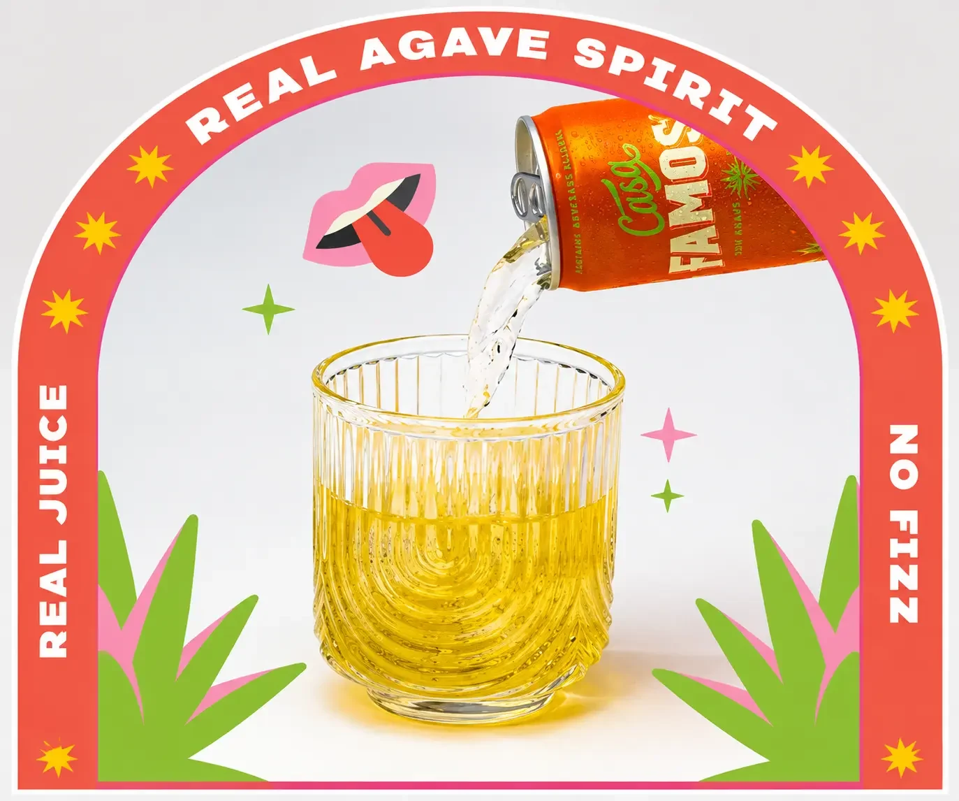
Someone landing from social has no idea what an agua fresca is, whether it contains alcohol, or why it isn't fizzy. So the answer arrives immediately — real juice, agave spirit, no fizz — as artwork rather than a paragraph, because nobody reads a paragraph at that moment.
- The product proposition answered in three words, visually
- People in the frame from the first image — this is a drink for company
- A moving gallery that reads as continuous with the social feed they came from
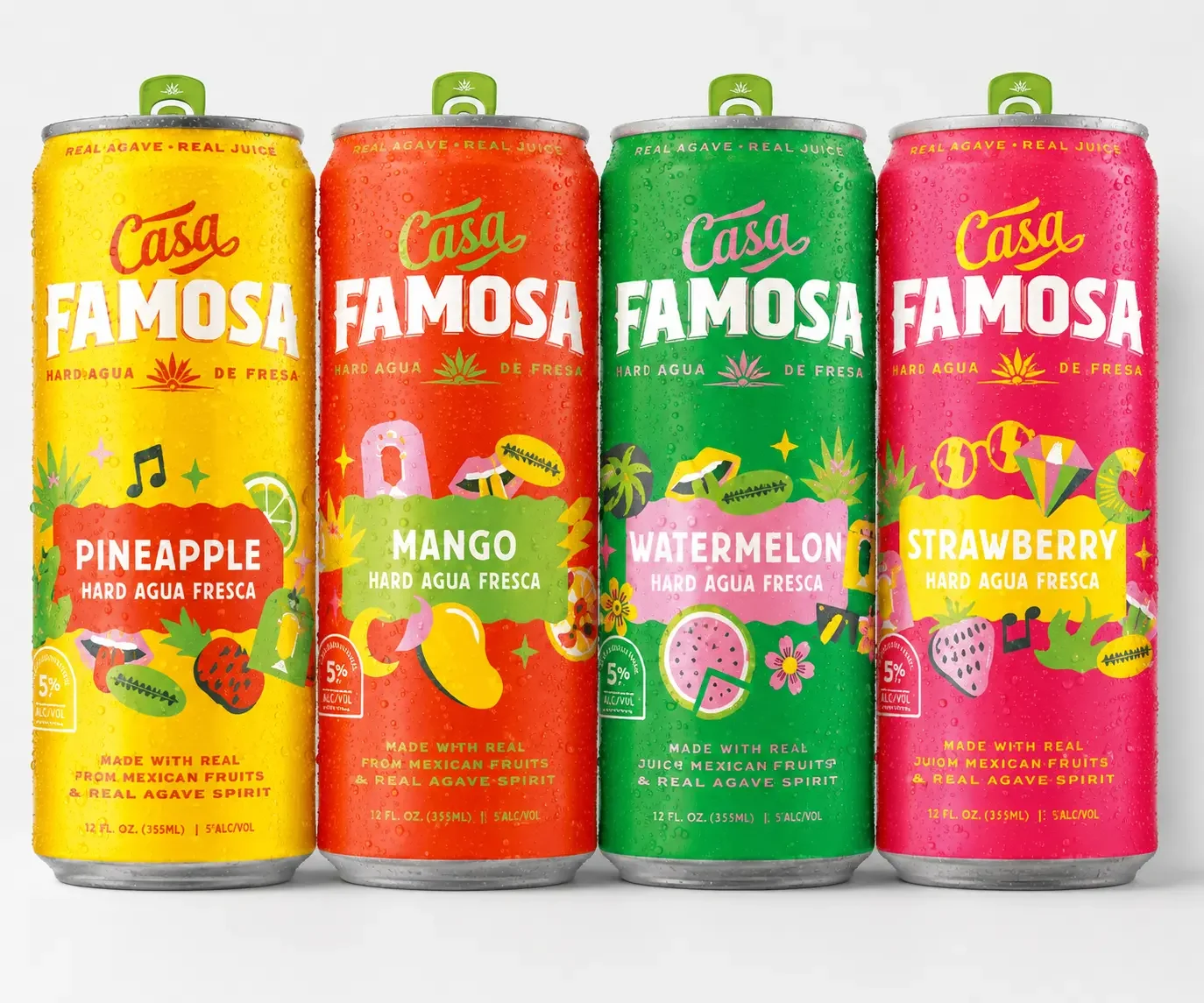
At launch the pack is the product. Pineapple, mango, watermelon and strawberry are shown together, because the first purchase is the variety pack and the choice a shopper makes is whether to try Casa Famosa at all — not which can to pick.
- The pack merchandised as the hero, not four separate products
- Colour used to tell them apart at shelf-recognition speed
- Structured so a new flavour is a content addition, not a rebuild
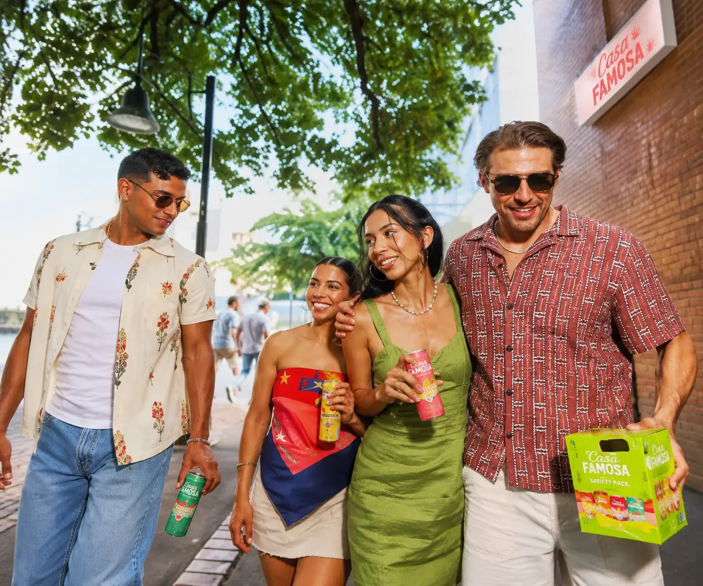
This is the conversion point of the entire site. The moment someone decides they want to try it, the design's only remaining job is to tell them where — quickly, on a phone, wherever they happen to be standing.
- Retailer lookup reachable from every page, never buried
- Given the brand's own voice rather than treated as a utility page
- No competing checkout — the retail channel does the selling
For a launch, an email address is worth more than a single sale — it's the audience for flavour two and the summer campaign. So the sign-up had to be properly wired into the marketing and customer systems, with consent travelling alongside the person.
- Permission recorded at the moment it's given, with the region attached
- Marketing profile and customer record created together, not separately
- Withdrawal flowing back to every system holding that person
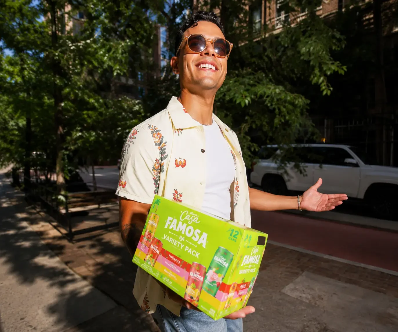
The brand is made of pictures. Pictures make pages slow.
Casa Famosa's whole identity is visual — photography of people, pack shots, patterns, colour, movement. Stripping that back to make the page fast would have destroyed the thing we were hired to build. But a visitor arriving from a social post on a mid-range phone gives a page a couple of seconds before their thumb moves on, and for a launch every one of those is a person who may never come back.
So the tension was never resolved by choosing a side. It was engineered.
We didn't reduce the number of images or soften the design to hit a speed number. The photography is the product experience — it stays, and the engineering works around it.
Content is served ready to read rather than assembled in the browser after arrival, so the first thing a visitor sees is the brand rather than a loading state.
A phone is never sent a desktop-sized photograph. Modern formats and per-device sizing carry most of the weight saving, invisibly.
On real phones over mobile data, not on office broadband with a laptop — which is the condition under which almost every brand site is signed off and almost none are used.
Scoped tightly, on purpose.
The most valuable decisions on this project were about what not to build. A launch budget spent on features nobody uses is a launch budget not spent on being found.
Not "raise awareness" — something testable. Take someone from a scroll to a shelf, and capture the ones who aren't ready to buy yet. Everything got measured against those two.
No commerce, no recipes, no loyalty mechanic, no long-form content. Each was considered and dropped, because the retail channel does the selling and year one is about trial.
Most visitors arrive from Instagram or Facebook, mid-scroll. Every layout decision was made at that width first and adapted upward, rather than the other way round.
Content managed independently, so a new flavour, a campaign asset or a seasonal update happens in an afternoon. A launch brand changes constantly in its first year — the site had to keep up without us.
Still ours. Campaign moments, new content, performance work and platform maintenance delivered as ongoing work rather than a change request each time.
Year one is when a launch brand changes most.
New flavours, seasonal campaigns, retail partnerships, sponsorship moments — a brand in its first years asks more of its website than an established one ever does. A site handed over at launch and left alone starts falling behind the brand within months.
We're still on it. The team who designed and built Casa Famosa is the team that publishes to it, tunes it and extends it as the brand grows.
Fast on a phone, editable in an afternoon.
Two requirements drove every choice. It has to render before someone's thumb moves on, and the brand team has to be able to change it without booking developer time.
- Next.js
- Server-rendered pages
- Optimised imagery
- Mobile-first layouts
- Contentful
- Structured content types
- Brand-team publishing
- Locale-aware routing
- Marketing platform sign-up
- Customer record creation
- Consent captured at source
- Retailer locator
- Age verification
- Cookie consent management
- US privacy request route
- Accessibility standards
Related case studies.
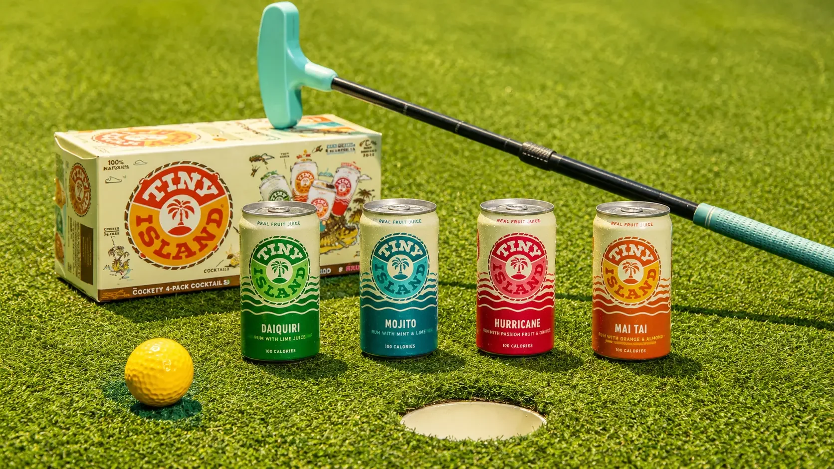
Tiny Island makes mini Caribbean rum cocktails — Hurricane, Mojito, Mai Tai, Daiquiri. Nobody needs those explained, which sounds like an easy brief and isn't. When the drink is familiar, the scepticism moves to the format: can a pre-mixed cocktail in a small can actually be worth drinking? We designed and built the site that answers that, and we still work on it.
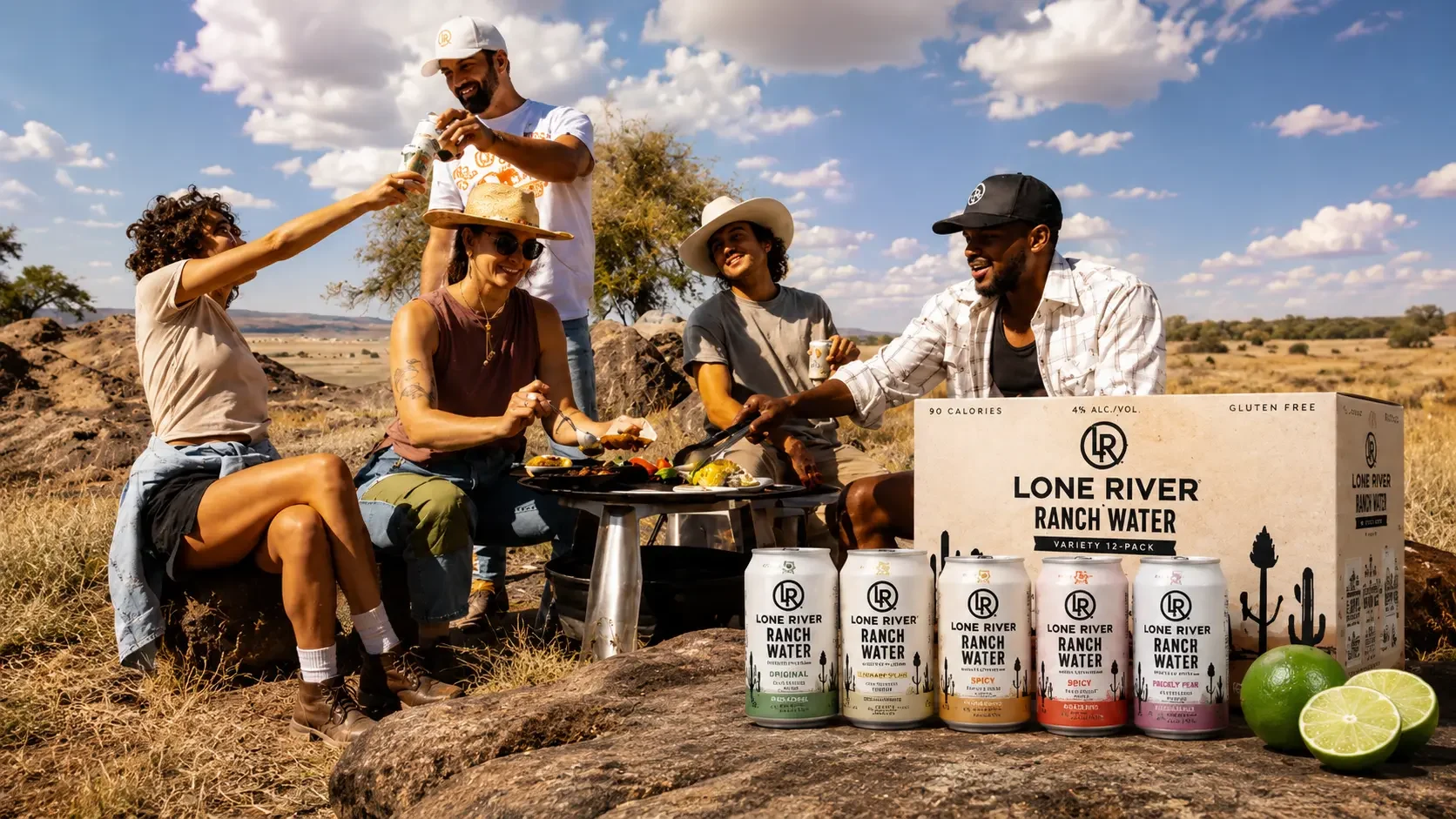
Lone River makes Ranch Water and Ranch Rita, and its identity is Far West Texas — the scale of the landscape, the idea of going somewhere nobody has been. Beautiful positioning. It also has to coexist with the least romantic question in drinks: is there any in the shop near me, today. We built the site that answers both, and we still work on it.